Insight
Aggregation Hides the Truth
The dashboard says green. The team is drowning. Aggregation hides the truth.
The surprise that keeps repeating
An initiative that reported green for six months flips to red in a single review. The quarterly deep dive surfaces a problem the delivery team has been living with since spring. A date slips, and everyone close to the work says they saw it coming.
If those scenes are familiar, you have already met the pattern. The interesting question is why it repeats in organizations full of competent people and expensive reporting tools.
The false read
The usual explanation is candor. Teams hid the problem. Middle managers filtered the bad news. The fix that follows is cultural: encourage honest status, celebrate early escalation, maybe add a health field to the template.
Candor is worth having, and status cultures do distort. But the explanation fails a simple test: the surprises keep happening in organizations where people report truthfully. Every input to the dashboard can be accurate and the output still misleading, because the reporting rule can hide a consequential difference even when its inputs are accurate.
The mechanism is the rollup itself
Take a portfolio of five teams, an illustration by construction. One is blocked waiting for an architecture review. One is thrashing on shifting requirements. One is underwater from attrition. One sits idle behind a dependency. One is moving fast. Roll them up and the portfolio reads “generally on track with some challenges.” In this hypothetical reporting rule, the fast team’s progress offsets the reported problems. Four of the five need help, two are stopped outright, and no line of the summary says so.

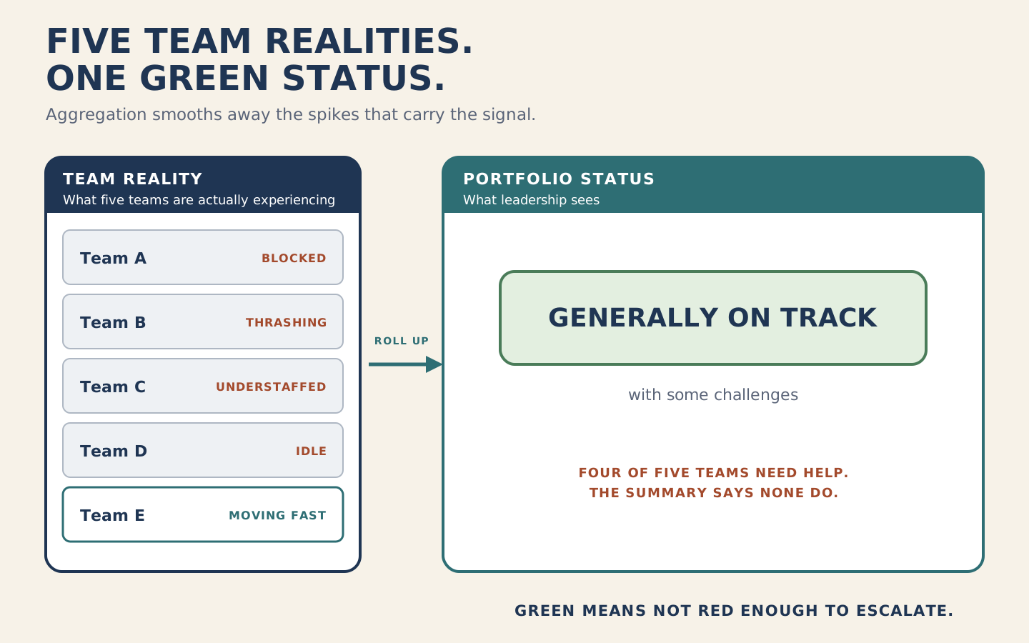
The summary follows the reporting rule. The decision maker sees a reassuring status without seeing which teams need intervention. A more candid discussion of the same aggregate would still omit those distinctions.
Then the incentives finish the job. Where green is expected and red draws scrutiny, staying green becomes a skill. Teams absorb problems silently and manage the optics, because that is what the system rewards. The reporting layer becomes a performance, not a signal. Portfolio Fog carries the full mechanism and its boundaries.
What the fog costs
Leadership steers on false signals. Resource decisions follow the healthy-looking picture, so the blocked teams stay blocked and the overloaded ones get more work. By the time the aggregate finally turns red, the problem has had months to mature. Early intervention was available the whole time; the signal that would have triggered it never survived the rollup. What reaches leadership is a crisis that used to be a manageable problem.
Then comes the reflex that makes it worse. The late surprise reads as a communication failure, so leadership adds reporting. More rollups, more review meetings, more aggregation. If the added reporting repeats the same compression, it can preserve the visibility problem while adding work.
What changes when you see it
The practical shift is small and uncomfortable: stop treating the aggregate as a diagnostic instrument. It is a consumption format. It answers “what can fifty teams’ status fit into,” and that question has nothing to do with “where is my portfolio actually stuck.”
Steering needs the spikes the rollup removed. That means routinely sampling extremes rather than averages: the longest-blocked team, the initiative with the oldest unresolved dependency, the team whose status has been green the longest without independent evidence. It also means measuring the reporting layer itself, the way you would measure any other system component that can fail.
The visibility-lag record identifies the interval to examine. The next step is to find what leaders decided during it.
Applied Test: measure your visibility lag
Build the three-case visibility-lag record defined on the concept page. For each case, place the relevant portfolio decisions beside the dates when the team recognized the problem and leadership received the evidence.
- List the decisions made during the gap.
- For each decision, identify the information the decision maker had and the options still available at the time.
- Compare that information with what the team already knew. Identify a decision-relevant omission, if there was one.
- Where an omission affected the choice or prevented timely consideration, change the escalation path or summary to preserve that information.
- Check a later report to see whether the change worked.
If no consequential decision occurred during the gap, record that result. The length of the lag alone does not establish decision harm.
Sources and validation
This Insight is derived from the Portfolio Fog treatment in the Alignment Drift barrier of Applied End-to-End Flow: Enterprise. The five-team rollup is an illustration by construction, not a measured case, and the argument uses no external statistics. The examples explain the mechanism; they do not estimate its prevalence or establish a portfolio-wide visibility benchmark.
Curtis Hibbs and Joshua Barnes are co-creators of Effective Enterprise AI and Applied End-to-End Flow, and co-authors of the Applied End-to-End Flow book series. Their work combines enterprise diagnosis, value-delivery mechanics, and practical intervention patterns across strategy, portfolios, value streams, and teams.